Adjacent to the Top Pane

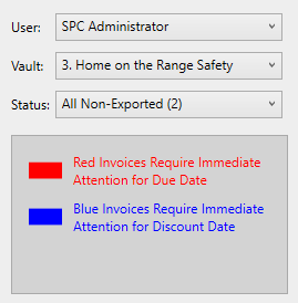
In the User field, the individual who logged in to Sage Paperless Construction will display. This is the default.
Keep the default or click to access the dropdown list. This list includes all proxy users. (Proxy Users)
In the Vault field, the vault last entered displays.
Keep the default or click to access the dropdown list if multiple vaults are available.
In the Status field, Pending displays as the default. All invoices with a Pending status assigned to this Reviewer display in the top header pane.
Keep the default or click to access the dropdown list. The count number that displays in the Status field reflects the total number of invoices, including any Unread invoices.
Note: If no invoices for the Reviewer exist for a particular status, the entire Approve Invoices screen will be blank. The Status field that typically displays above the top pane will not display.
Status
All Non-Exported |
Displays invoices in all statuses that are still in the routing system, and not yet exported to the accounting system. |
Approved |
Displays all invoices approved by this Reviewer. |
Attention! |
Displays all invoices requiring special attention. |
Non-Exported - Hold |
Displays all invoices placed on hold that are still in the routing system, and not yet exported to the accounting system. |
Pending |
Displays all invoices in a pending status. |
Rejected |
Displays all rejected invoices that are assigned directly or by proxy to this Reviewer. |
Reapprove |
Displays all invoices with a coding change after this Reviewer approved those invoices. |
(Advanced Bridge Setting) |
For some accounting systems, there are advanced bridge settings that allow invoices to be grouped together by the following: •Job (Enable Approve Invoices Job Filters) •Work Order (Enable Approve Invoices Work Order Filters) •Property (Enable Approve Invoices Property Code Filters) |
Invoice Header List (top pane)

To the left above the top pane, there is an All | Unread indicator that displays.
When All is active, every invoice in the selected Status field is visible in the top pane.
When Unread is active, every Unread invoice in the selected Status field is visible in the top pane.
Note: An Unread invoice has not yet been accessed (similar to an unread email). Unread invoices include those invoices that were rerouted to a user either manually or by routing rules, as well as invoices with status changes.
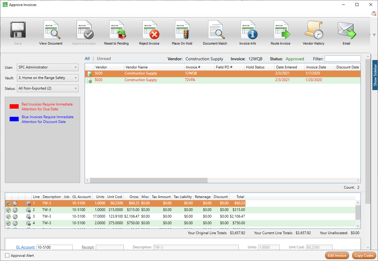
Vendor and Invoice located to the right above the top pane identifies the highlighted invoice. This is the invoice associated with the lines displaying in the middle pane and the detail displaying in the bottom pane.
To the right above the top pane, there is another Status identifier. This Status identifier reflects the status of the highlighted invoice.

In this example, the highlighted invoice has an Approved status. It is also part of the All Non-Exported status group which also includes invoices with Pending statuses.
There are also color cues to identify the various statuses.
Approved |
Green |
On Hold |
Orange |
Pending |
Blue |
Rejected |
Red |
Note: This matches the color cues used on the Invoice Entry screen.
The list of invoices that displays in the top header pane are based on the selections made in the Vault and Status fields.
The invoices in the list are color coded.
•Red - Invoices displaying in red font require immediate attention based on their due date. Any invoice that is due within the next 5 days or is currently overdue displays in red.
•Blue - Invoices displaying in blue font require immediate attention based on their discount date. Any invoice with a discount date that is expiring within the next 5 days displays in blue.
•Black - Invoices displaying in black font have no due date or discount date warnings.
To view an invoice in-depth, click to highlight that invoice. Invoice detail for that highlighted invoice will display in the middle and bottom grids.
Below the top pane is a secondary Count indicator.
•If Unread for the top pane is active, this count number reflects that.
•If All for the top pane is active, this count number reflects that.
Column Layout
Individual Reviewers can select columns to display and columns to hide.
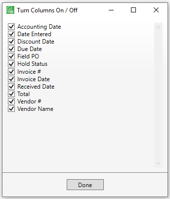
1.Right click on a column heading in the top pane to display the following Turn Columns On / Off dialog box:

All available column headings are listed, including custom field columns.
Columns that display will reflect the list of fields that display on the header section in Invoice Entry with a few additional headings such as Status, Invoice ID, etc.
If a user overrides a name in Invoice Entry, that revised name should display in Approve Invoices. Moreover, the filter list fields should also reflect the name change.
If a column heading does not represent a true field or if the column belongs to multiple line types, the system uses the default.
Except for the following, all other fields may be renamed and those new names will be reflected in the invoice header grid:
- Vendor Name
- Hold Status
- Date Entered
- Accounting Date
This is because the data columns in the grid do not correspond to entry fields.
Sage 300 only - Accounting Date, Received Date and Invoice Date columns will follow Advanced Bridge settings and will display the correct data regardless of the setting. |
2.To select a column heading to display, click to enter a checkmark.
To deselect a column heading so that heading is hidden, click to remove the existing checkmark.
3.When finished, click Done.
The Turn Columns On/Off dialog box will close.
Note: This functionality works at the invoice line level and as well as in the invoice pane.
Resizing the Invoice Header Grid

The Approve Invoices invoice header grid is configurable to allow for a larger viewing area. In addition, users may reorder, hide/show columns that will be systematically "remembered" on a user/vault basis.
Place the cursor in the darker area between the upper and middle panes to access the grab bar and manipulate the size of the invoice header grid (the upper pane).
Click here for details on the middle grid.
Click here for details on the bottom grid.